Lovely clear, calm, and mild evening. Stargazing with binoculars. The Eta Carinae Nebula, Omega Centauri, and then Jewel Box Cluster.
If You Find This World Bad, You Should See Some Of The Others. 🎵
Lovely clear, calm, and mild evening. Stargazing with binoculars. The Eta Carinae Nebula, Omega Centauri, and then Jewel Box Cluster.
If You Find This World Bad, You Should See Some Of The Others. 🎵
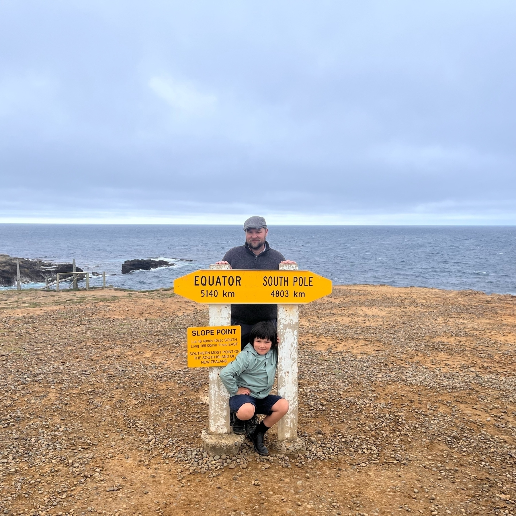
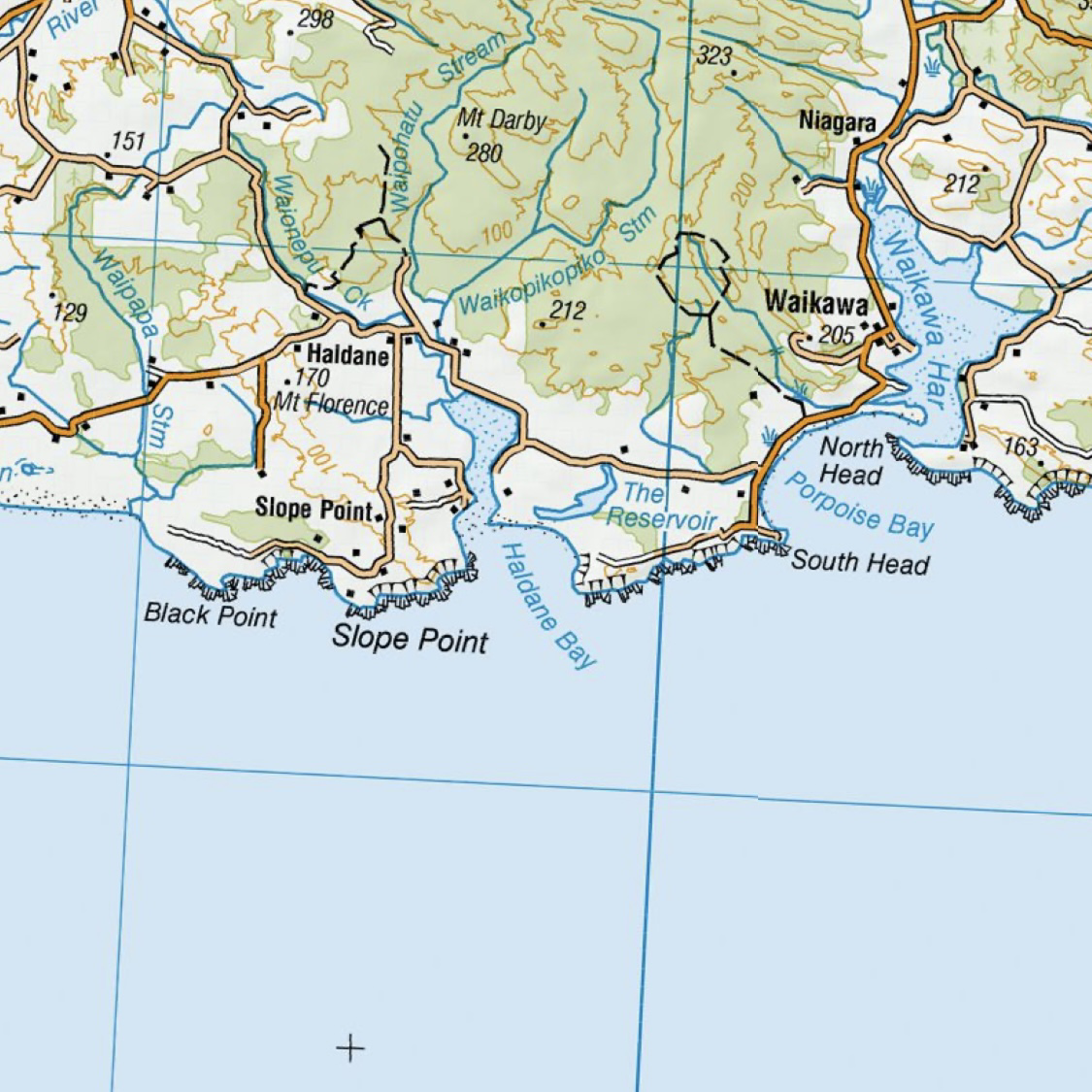
Slope Point
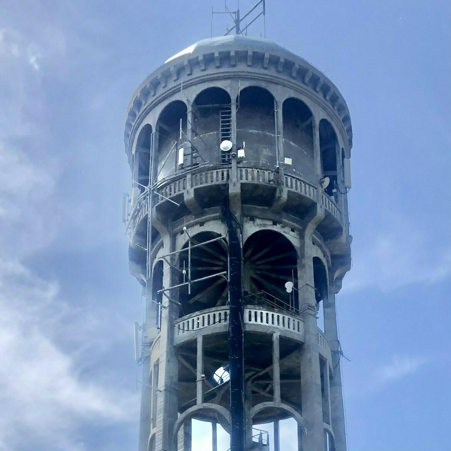
Bastia Hill
🖋 — I helped someone remove a Pilot converter from their Vanishing Point. Pliers were needed! 😧
My favourite Neil Young album is Dead Man (Music from and inspired by the motion picture).
I’ve often wondered why there is a mix of modern sounds—car engines—and the movie dialogue. Still it does not make it worse.
But Cortez the Killer—Neil’s song I most enjoy—is not on this album. Cortez the Killer, is a song that I could listen to all day. I often seek out new cover versions. Built To Spill and Slint both did excellent live versions.
💿🎵
Is there a better webcam in New Zealand than the Castlepoint Lighthouse? http://castlepointlighthouse.com/
Decided leave Dolby Atmos in the off state for my iOS devices. For me it lacks clarity (I don’t have lossless on) when listening with headphones.
I was able to switch between formats in the iOS settings: Dolby Atmos (Automatic | Off) to compare without much disruption.
The ‘Slint—Utica Quarry, Nighttime’ recording has a lot going on… 🎵🎛
My desk this morning.
Laptop and 🖋

Listening to @Brad and Pen Addict podcast ✒️ on the way to work this morning, and I hear an ad read for the micro.blog service. Delightful!
This is also a good prompt for me to use micro.blog more.
the Stargazer Lilies - Occabot 🎵
My mind swirls with the sounds.
I do not remember adding An Ode to the End podcast into my playlist… but came across it in my feed today. It’s weird and wonderful.
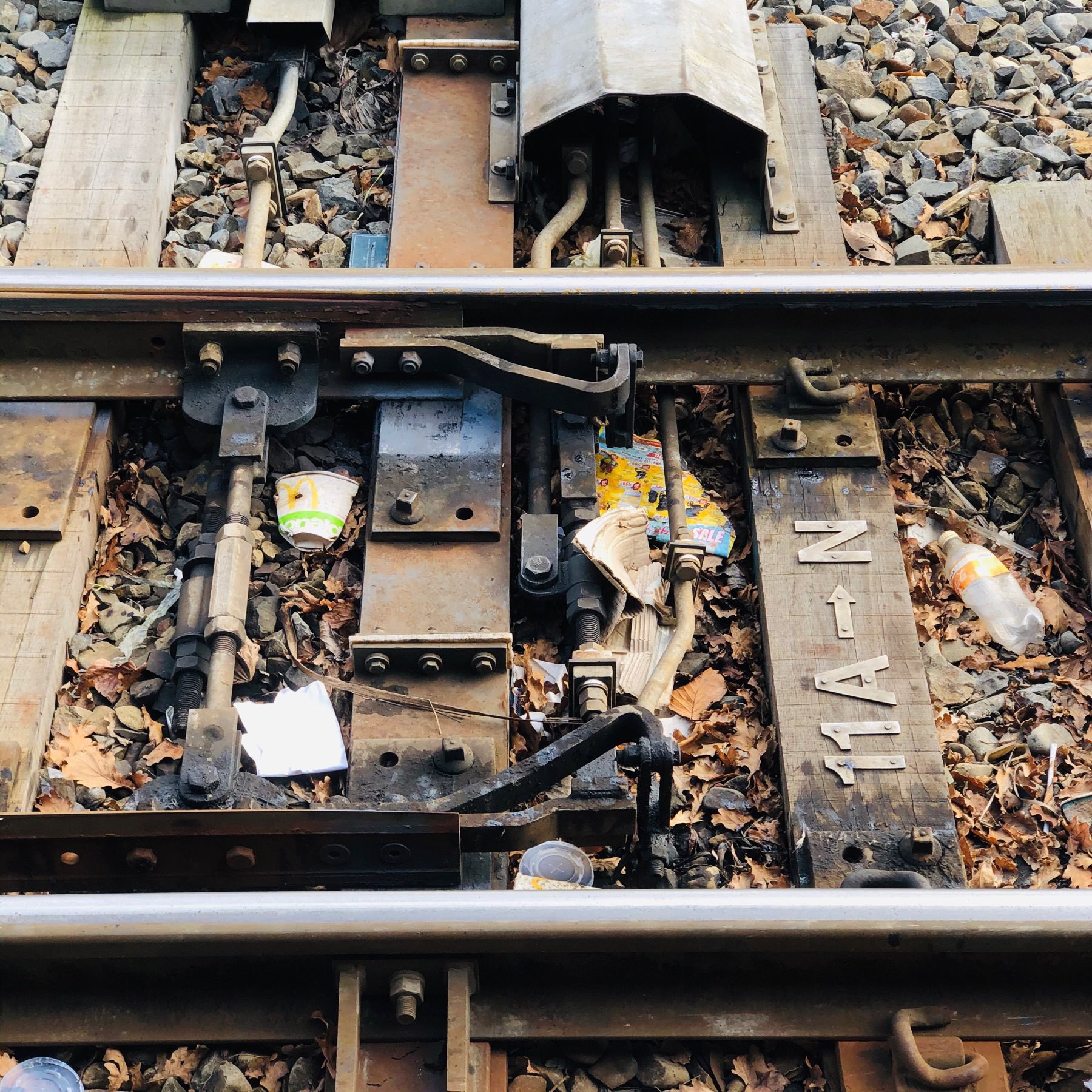
I’ve never seen a clean railway line.
多一事不如少一事
The less hassle, the better.
But directly translates to something more like ‘one more thing is not as good as one less thing’.
Another beautiful song with a geographical theme.
Glad I’ve discovered Polaroids of Polarbears. 🎵
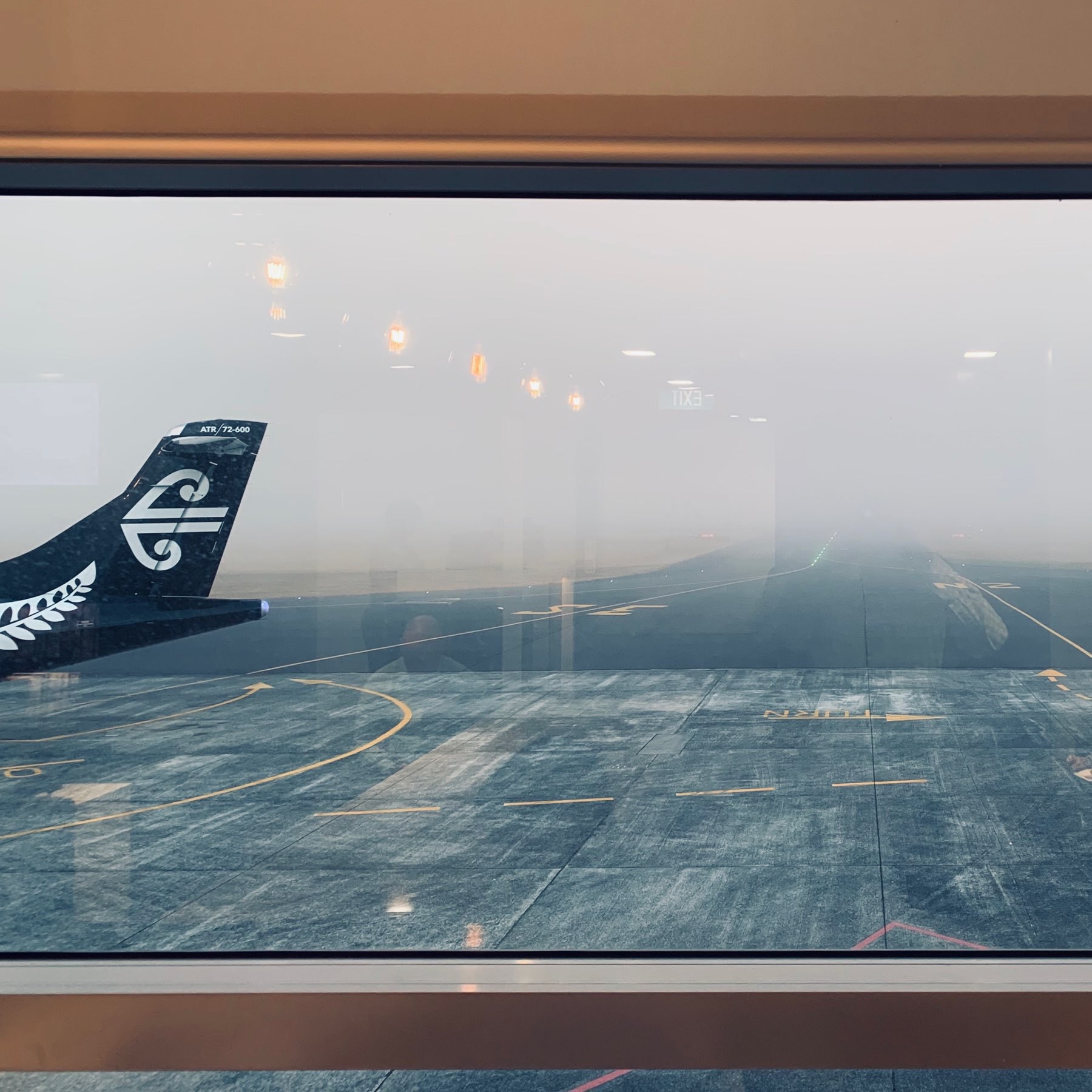
Hamilton Airport
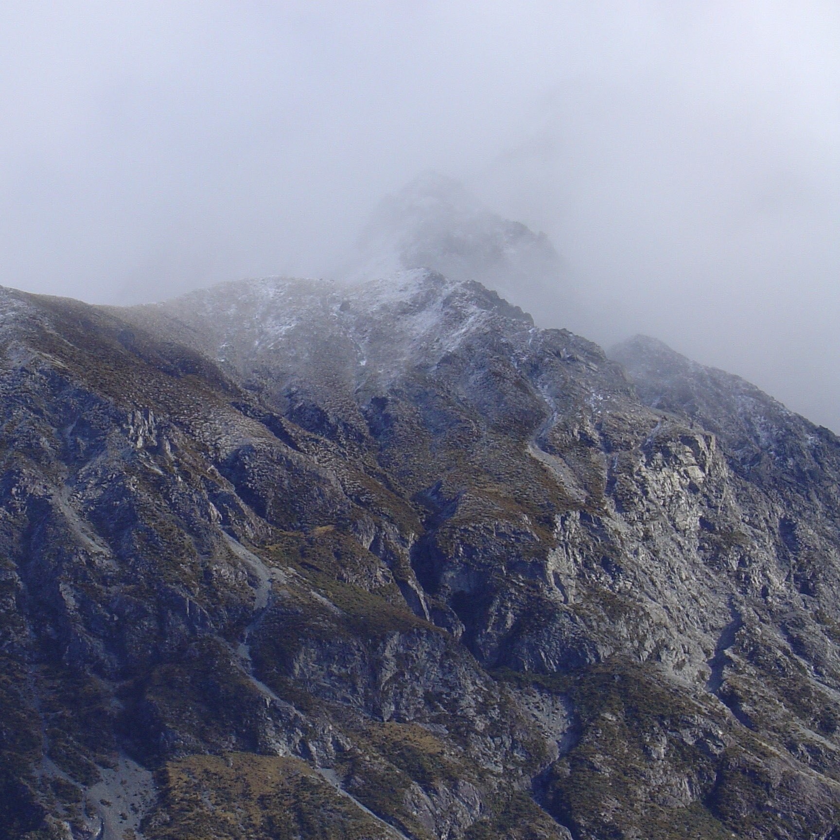
Up the Rakaia Valley — probably the Ragged Range.
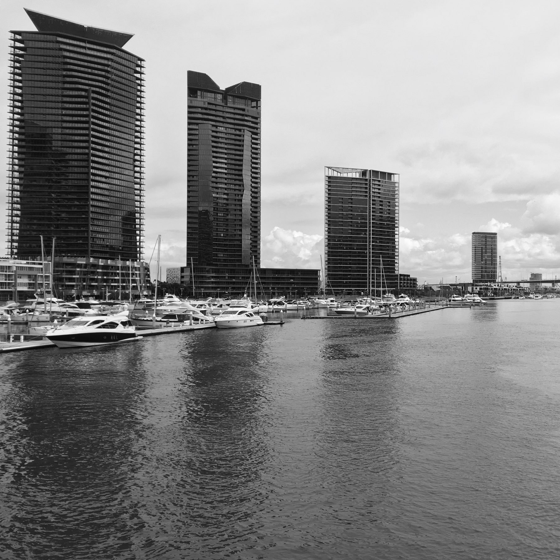
Docklands
Off-road competition

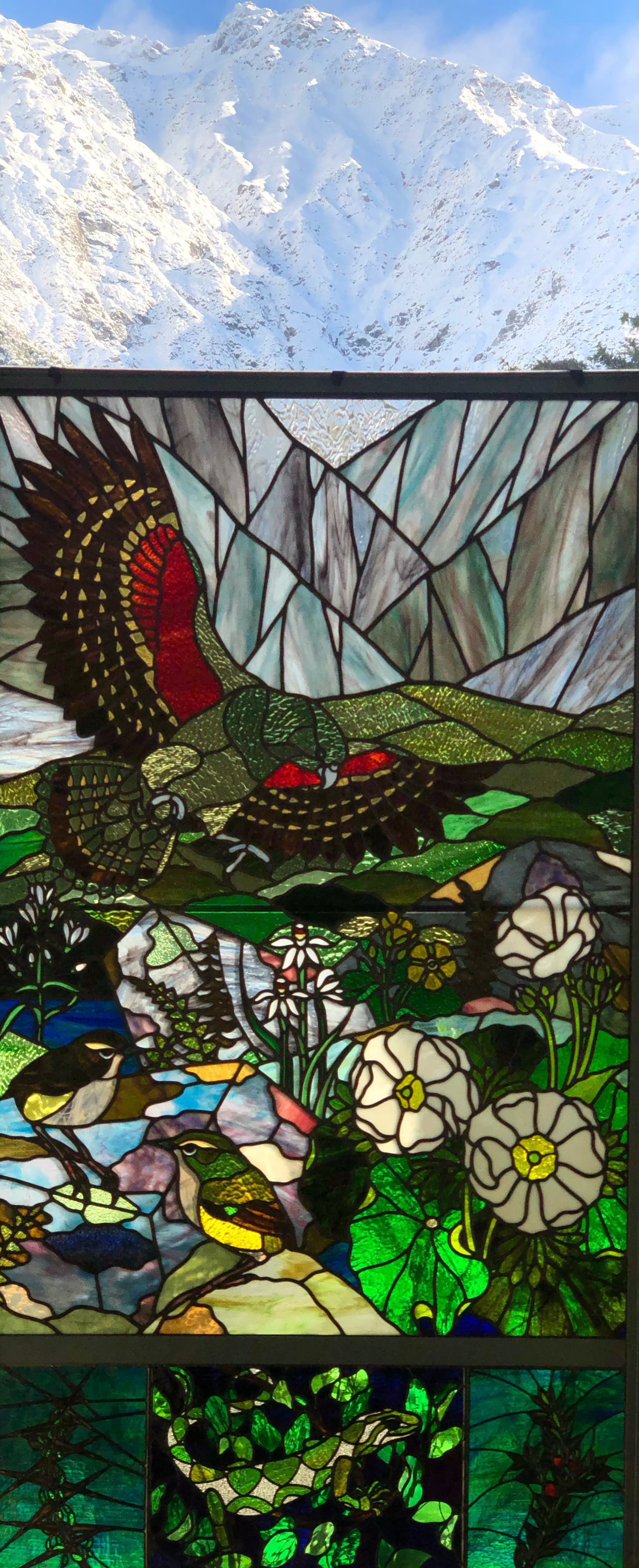
The Aoraki / Mount Cook information centre
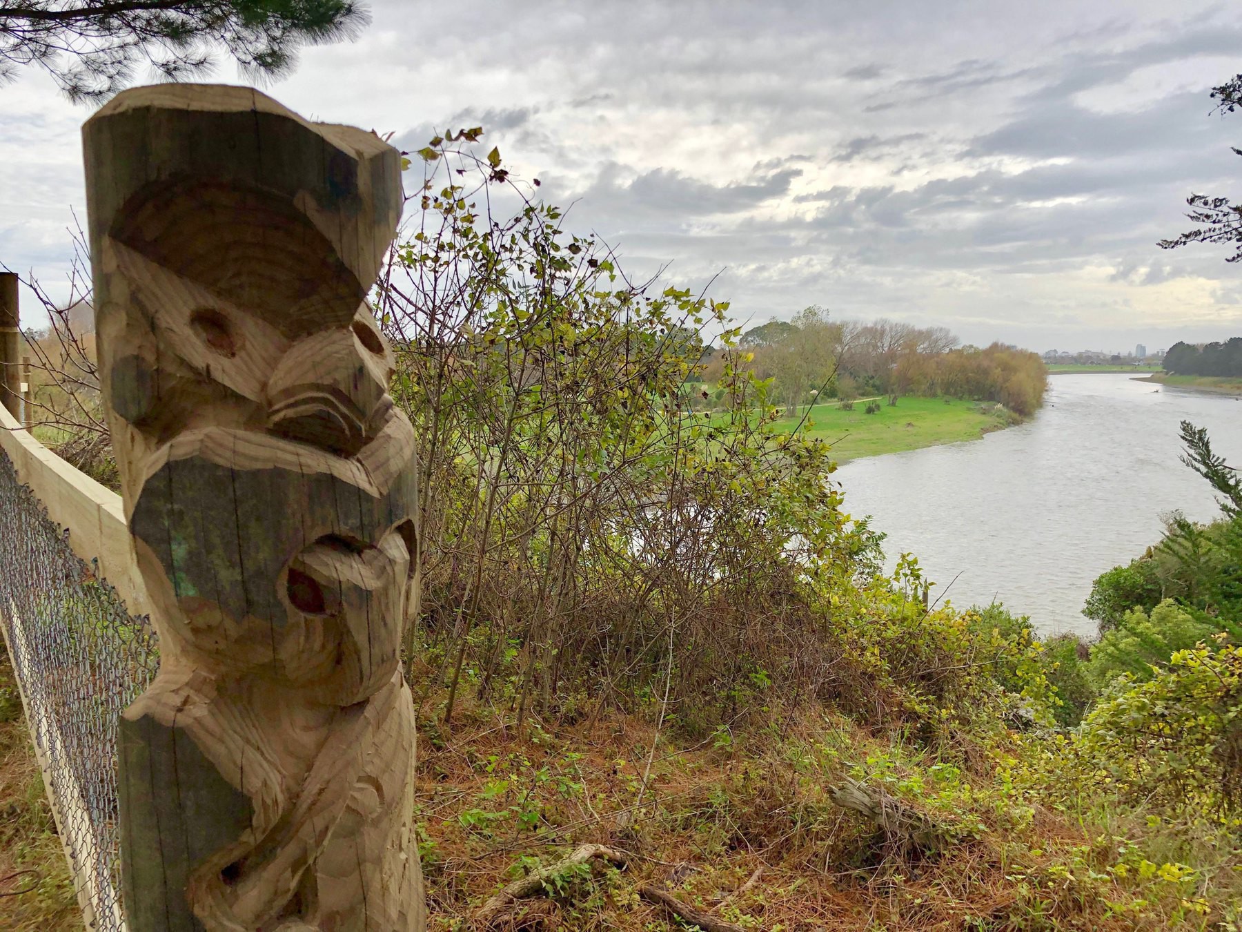
A new view of the city
Kaikōura
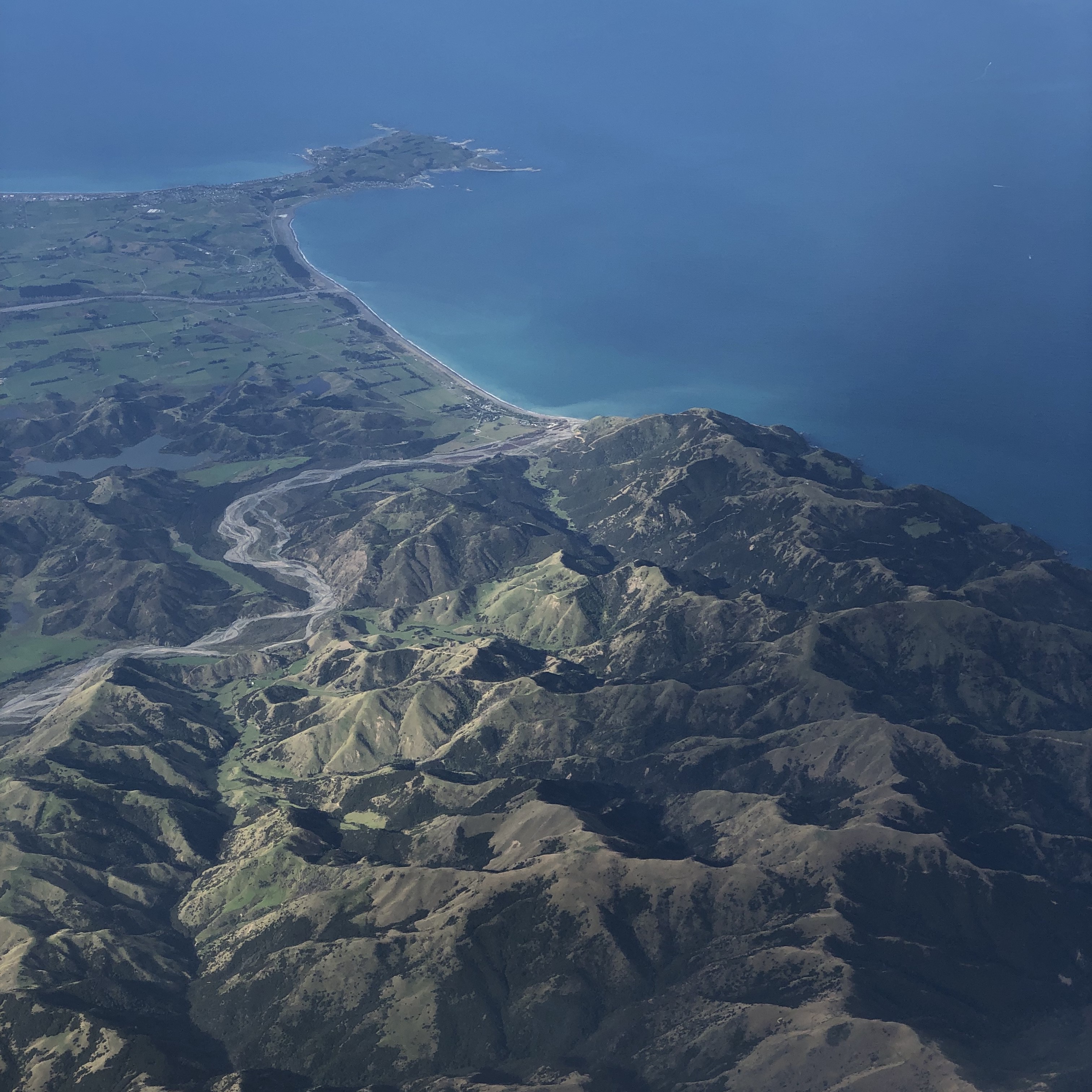
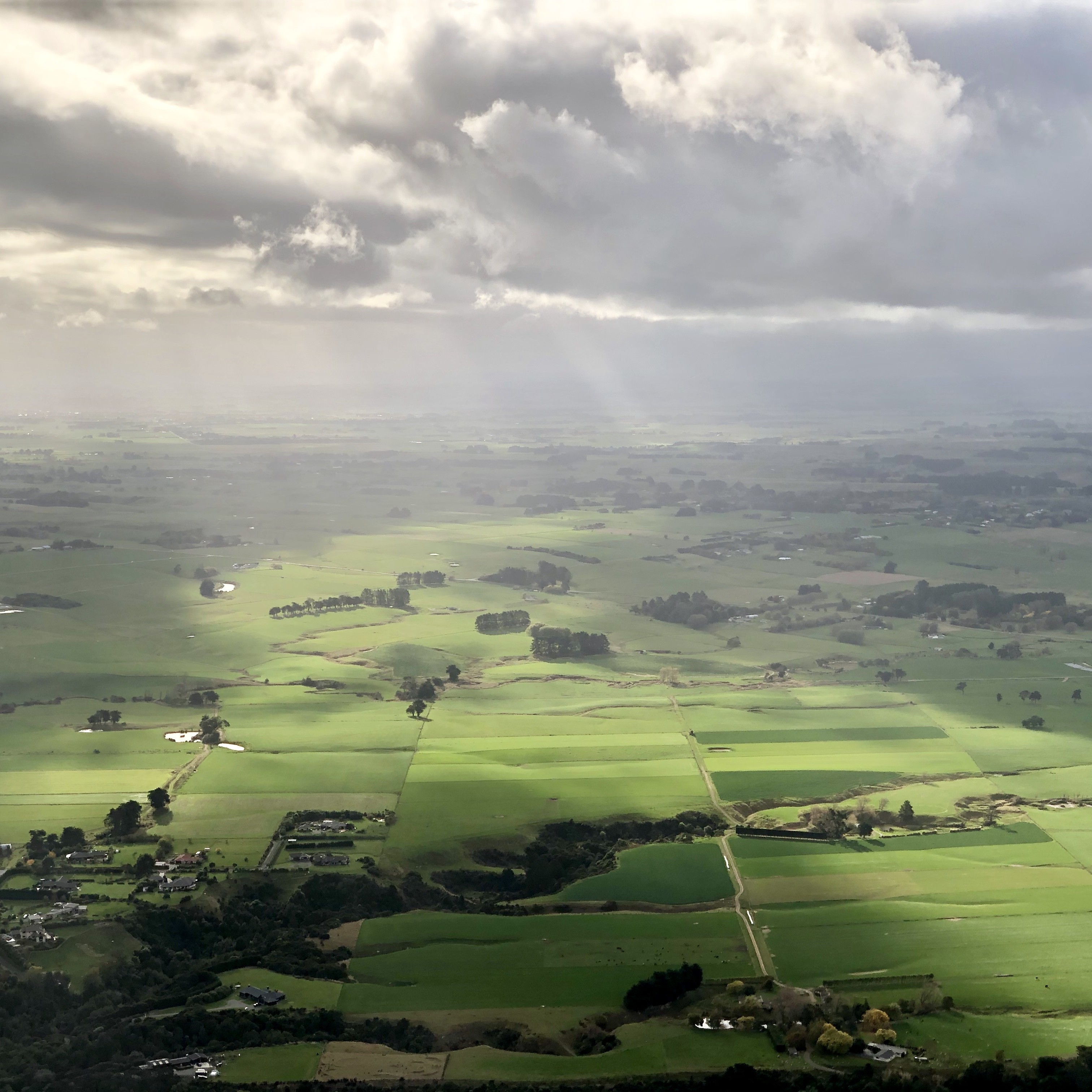
Ashhurst
Glentanner Airport
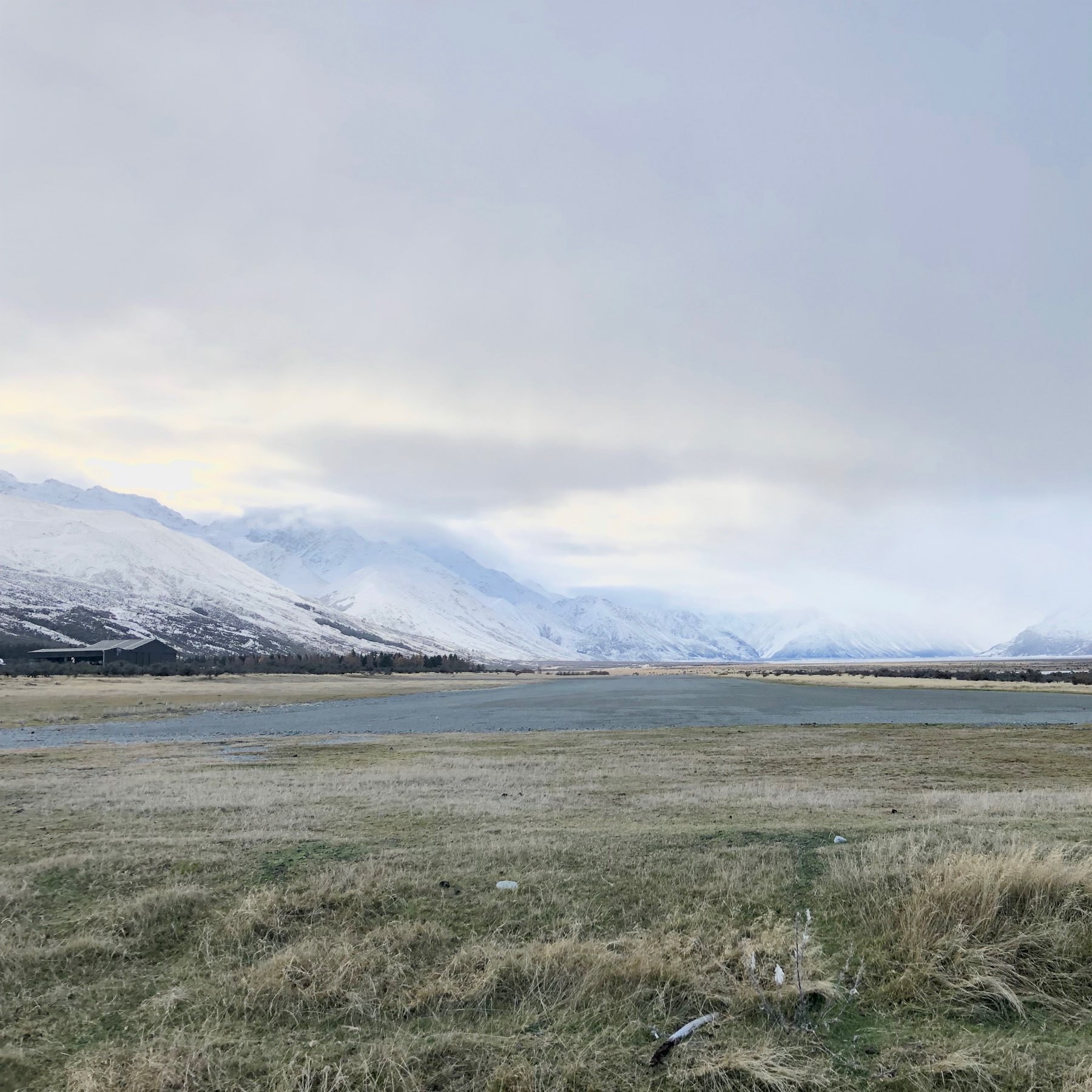
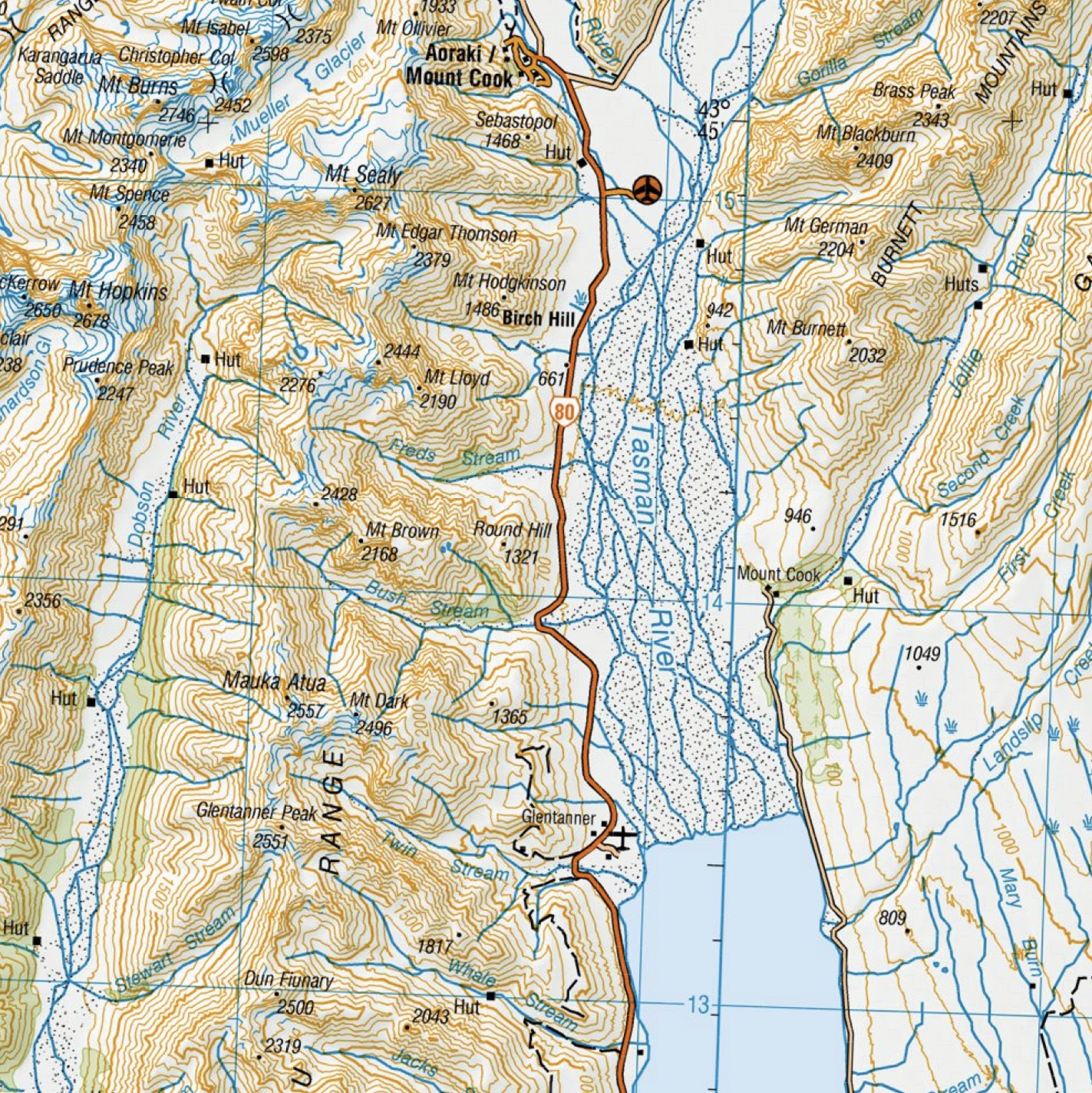
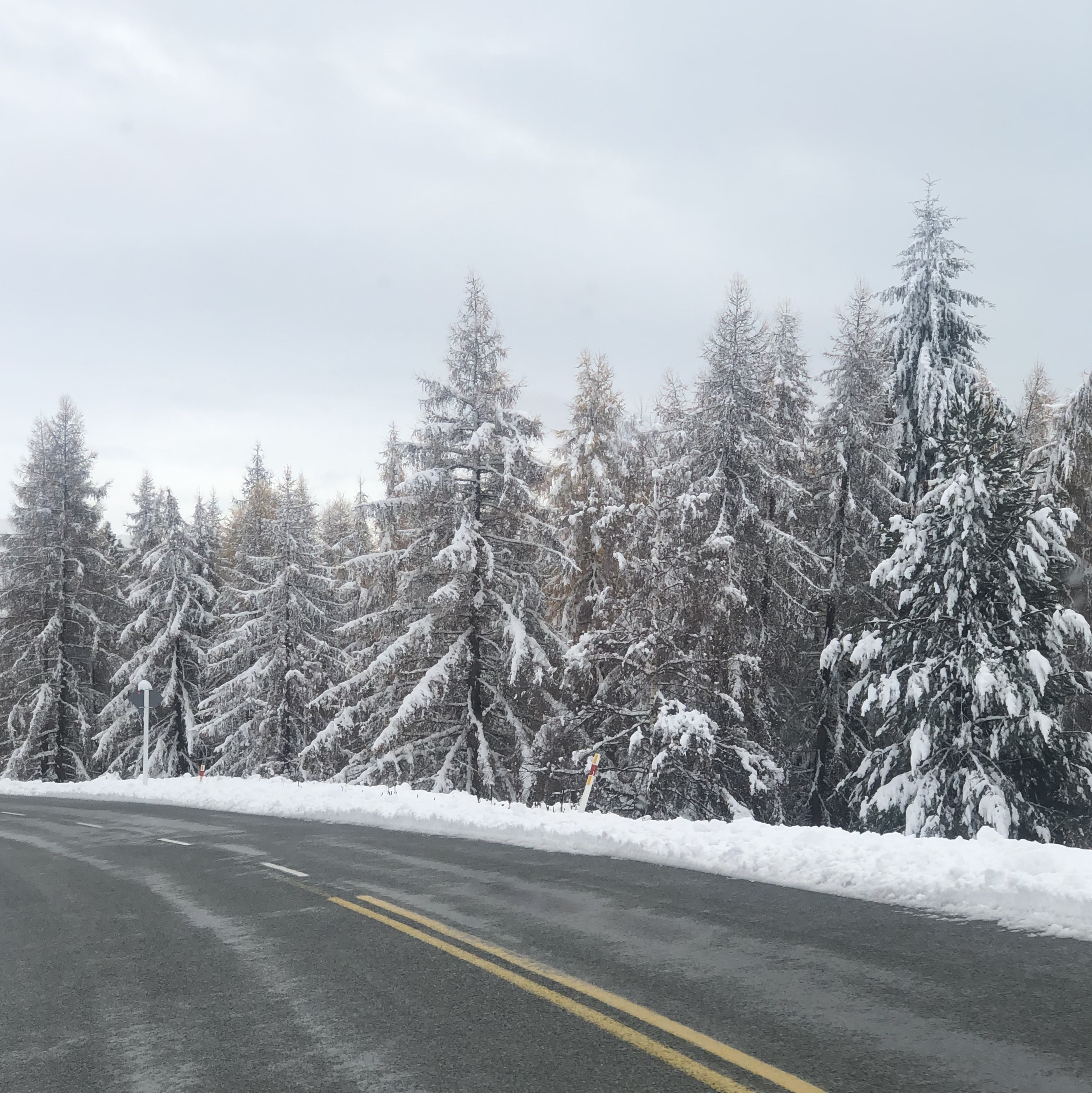
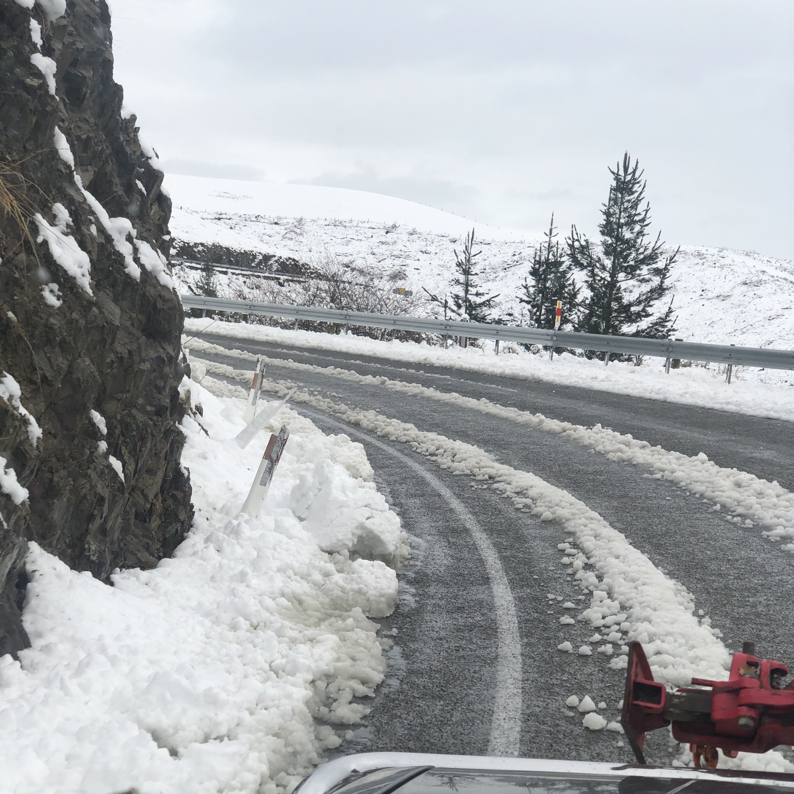
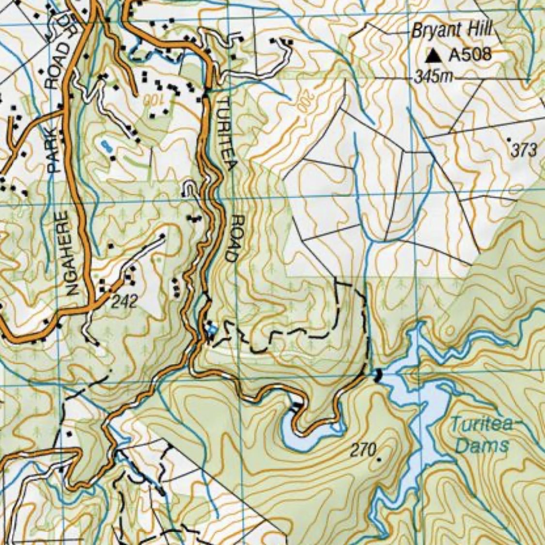
Craigieburn Road
![mp-photo-alt[]=](https://cdn.uploads.micro.blog/7963/2019/1567c9440d.jpg)
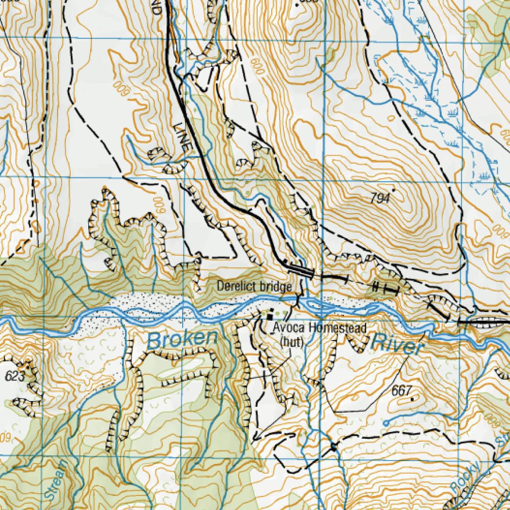

Looking East @ 5:30pm
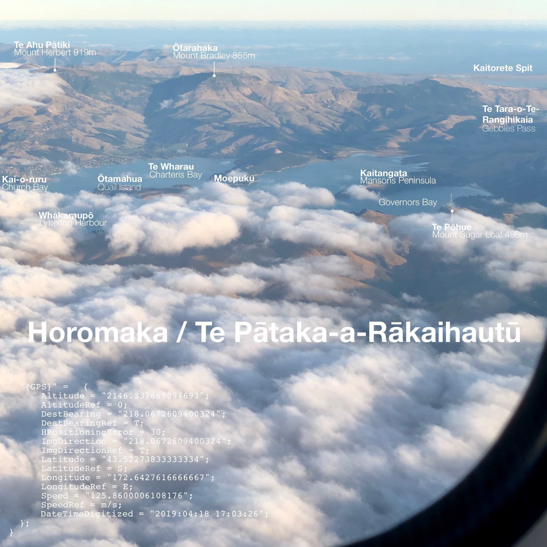
Te Pātaka-a-Rākaihautū — Banks Peninsula
UNIversal-MOtor-Gerät
![mp-photo-alt[]=](https://cdn.uploads.micro.blog/7963/2019/7406153b9a.jpg)

Himatangi — 1 hour from sunset.
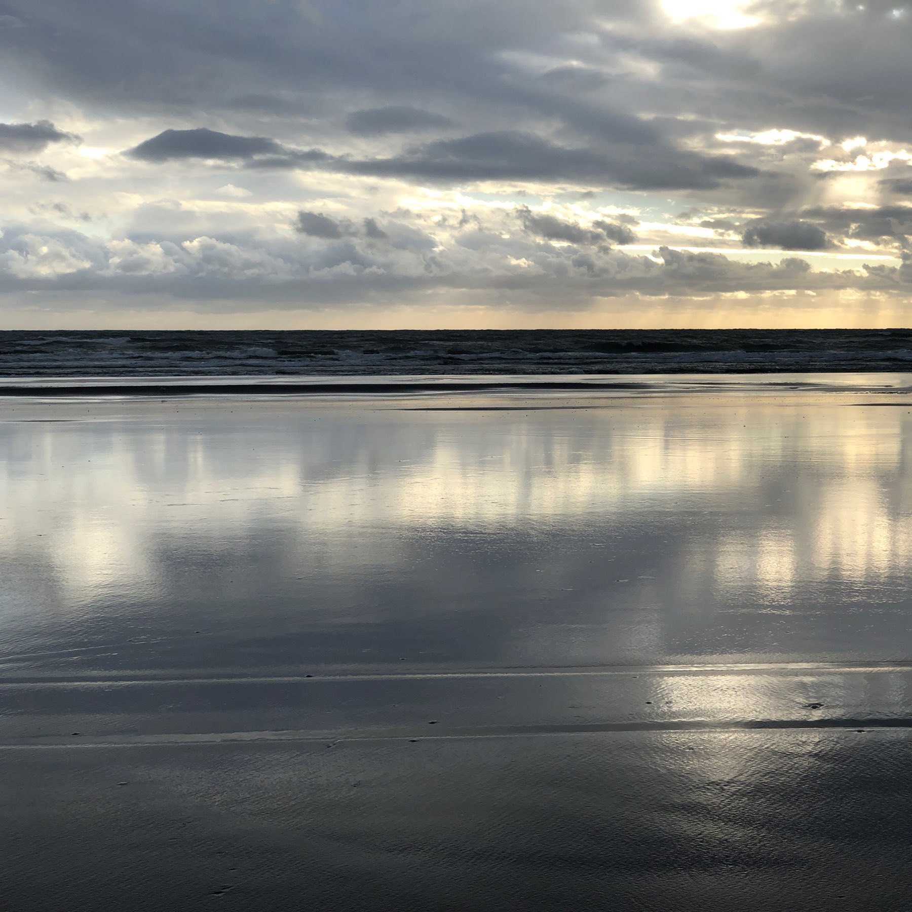
Himatangi Beach last night.
Travelling to or from Lake Tekapo.
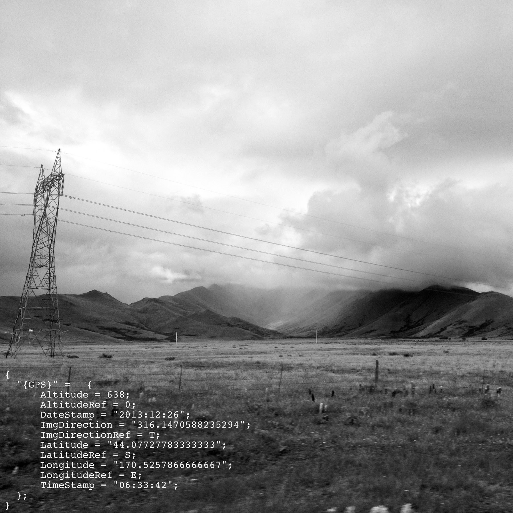
Unwinding in the dark with Mogwai –Young Team + Apple TV 4K screensavers.

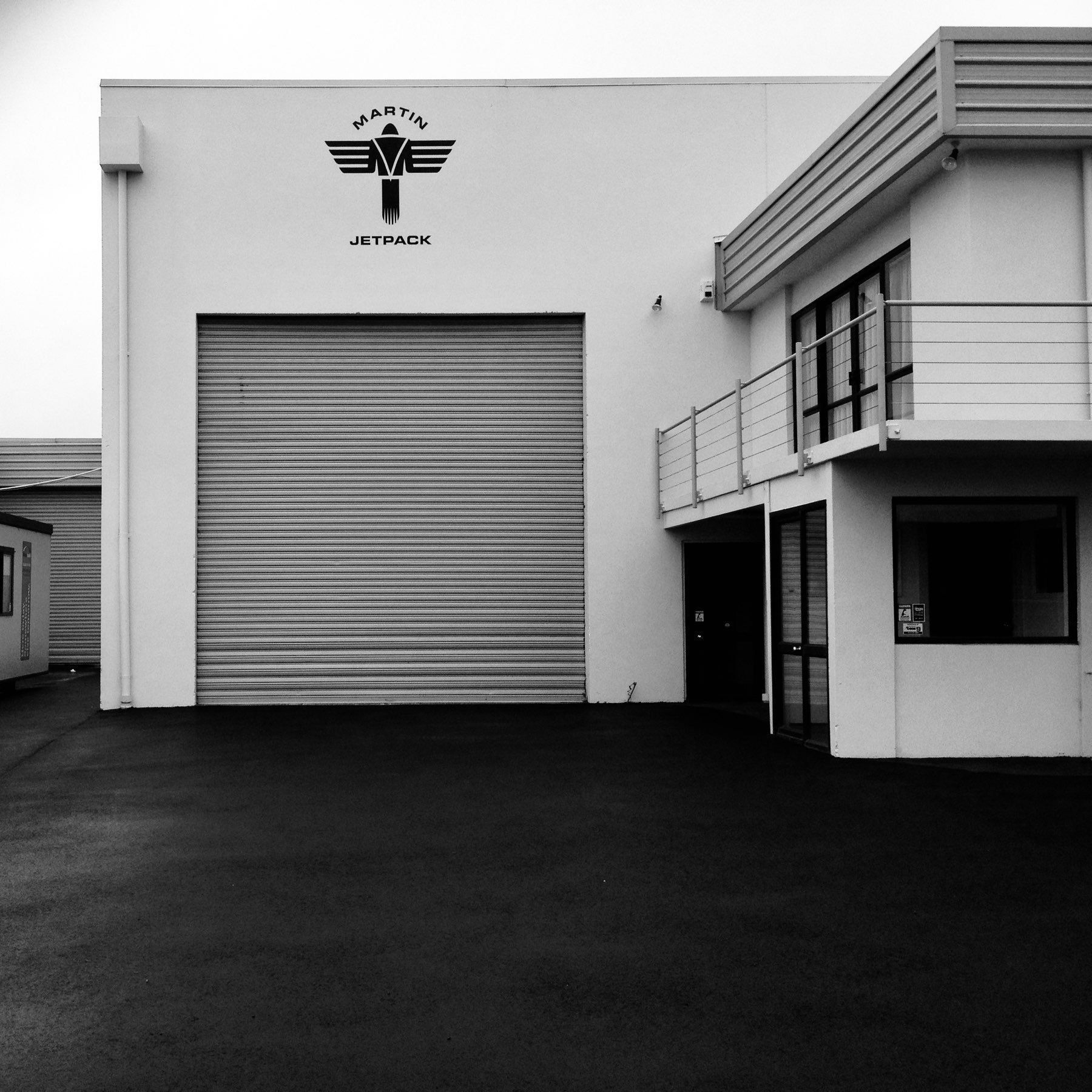
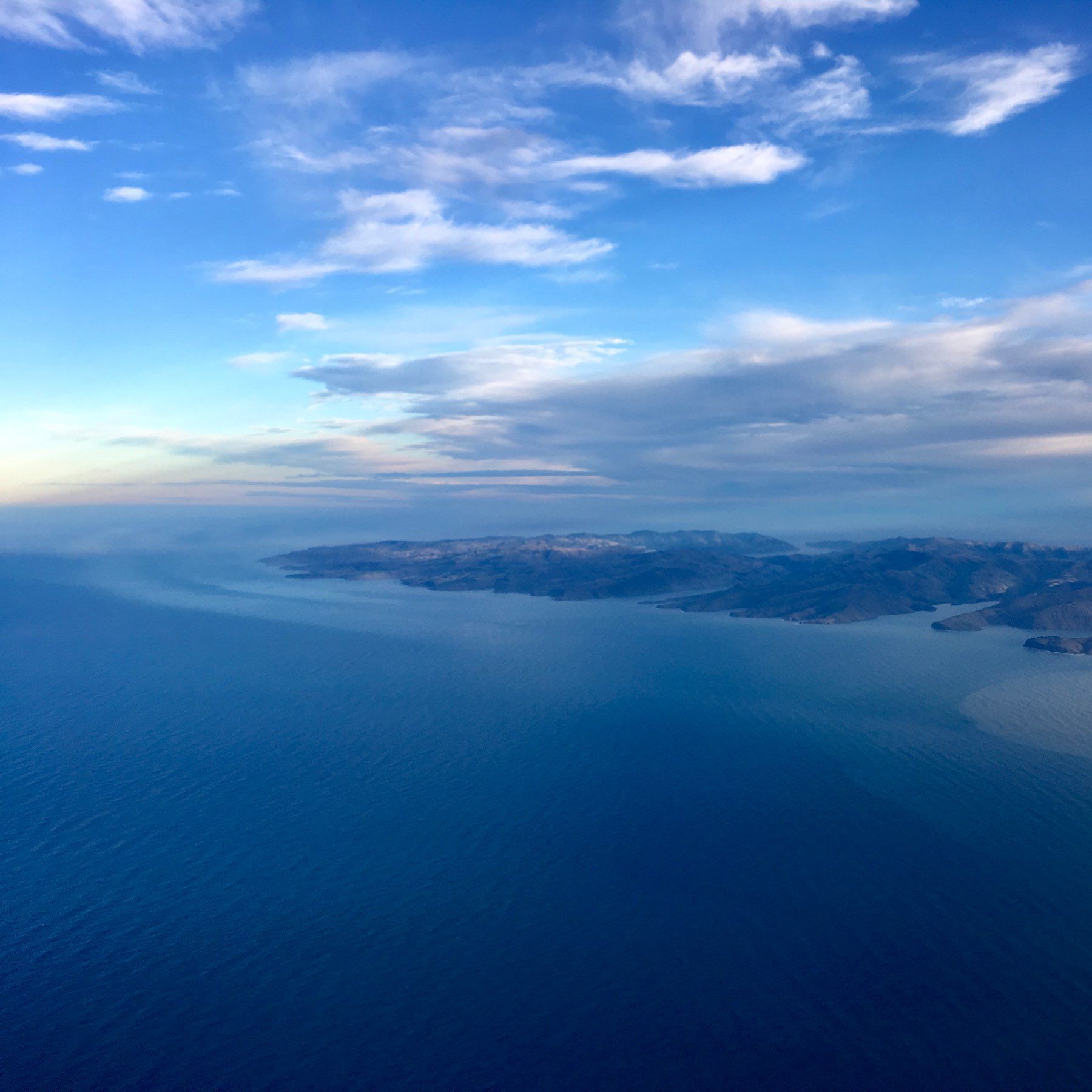
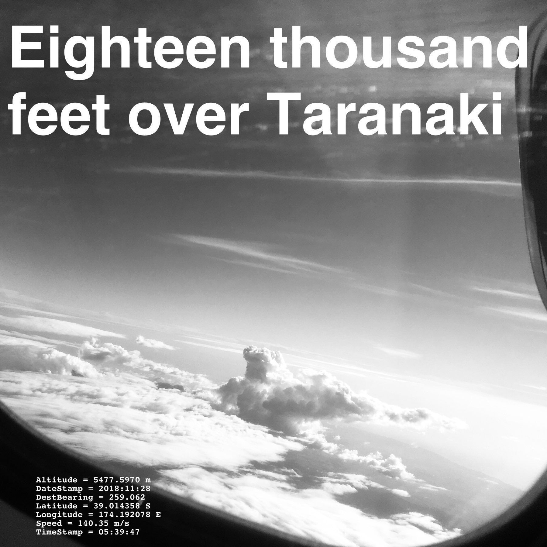
{ “{GPS}” = { Altitude = “5477.5970 m”; DateStamp = “2018:11:28”; DestBearing = “259.062”; Latitude = “39.014358 S”; Longitude =“174.192078 E”; Speed = “140.35 m/s”; TimeStamp = “05:39:47”; }; }

May every year be full of fish, and may there be enough fish for all.
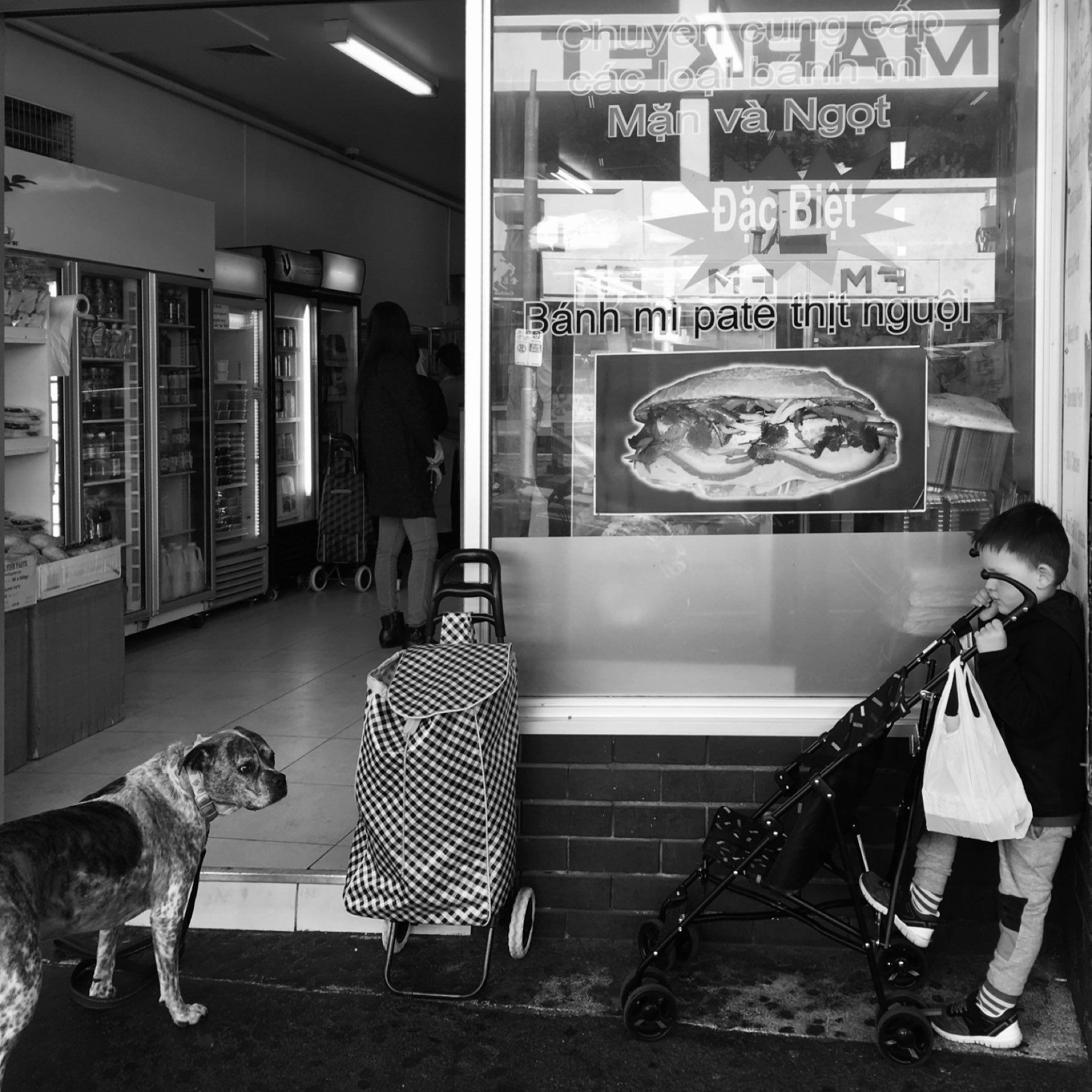
Coffee and Vietnamese food is a great combination.
I do not understand the desire for a dark UI in a well lit environment. Even with matte screens, everything is more susceptible to distracting reflections if the screen is dark.
Just realised that the iPhone SE currently omits the carrier name up in the status bar beside the signal strength. I like this.
The Duck Duck Go search result pages look crisp these days.
As it happens, I was recently appreciating the Open Street Maps implementation in the results.
Quite surpried to see that it is now Apple Maps.
Bearing: 73°. Temperature: 25°C.
Wishing iOS on the iPad would render iPhone only apps as pop over applications (from the left or right). Rather than full screen portrait applications.
On high repeat right now. 🎵 The Notwist - Superheroes, Ghostvillains & Stuff
And a new music genre for me to check out more of: melancholic indietronica.
Beautiful morning to start the Christmas holiday.
A post to get the first post out of the way.
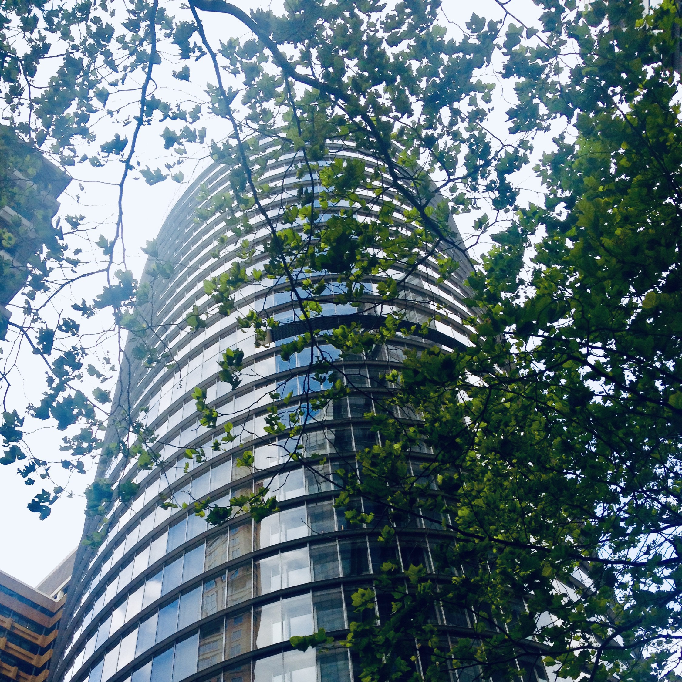
1 Bligh — Sydney
